Color Outside the Lines – How to Approach Paint Differently
A room is typically defined by its walls: four flat planes that intersect with flooring and a ceiling. When it’s dumbed down, it can feel rather boring. At some point there will be a debate about the finishes. Paint? Or wallpaper? Will the walls and trims match with a single color (v. classy), or should they contrast for more definition? Of course, if you’re feeling spicy there could be an accent wall.
Let’s not be confined by these lines. Let’s push the envelope a bit further…
What if we treated walls like an open canvas and played with the geometry? This may feel a bit avant-garde, but color blocking extends the boundaries and allow a room to make statement. The key is to be deliberate in the application. Take a look and tell us what you think:
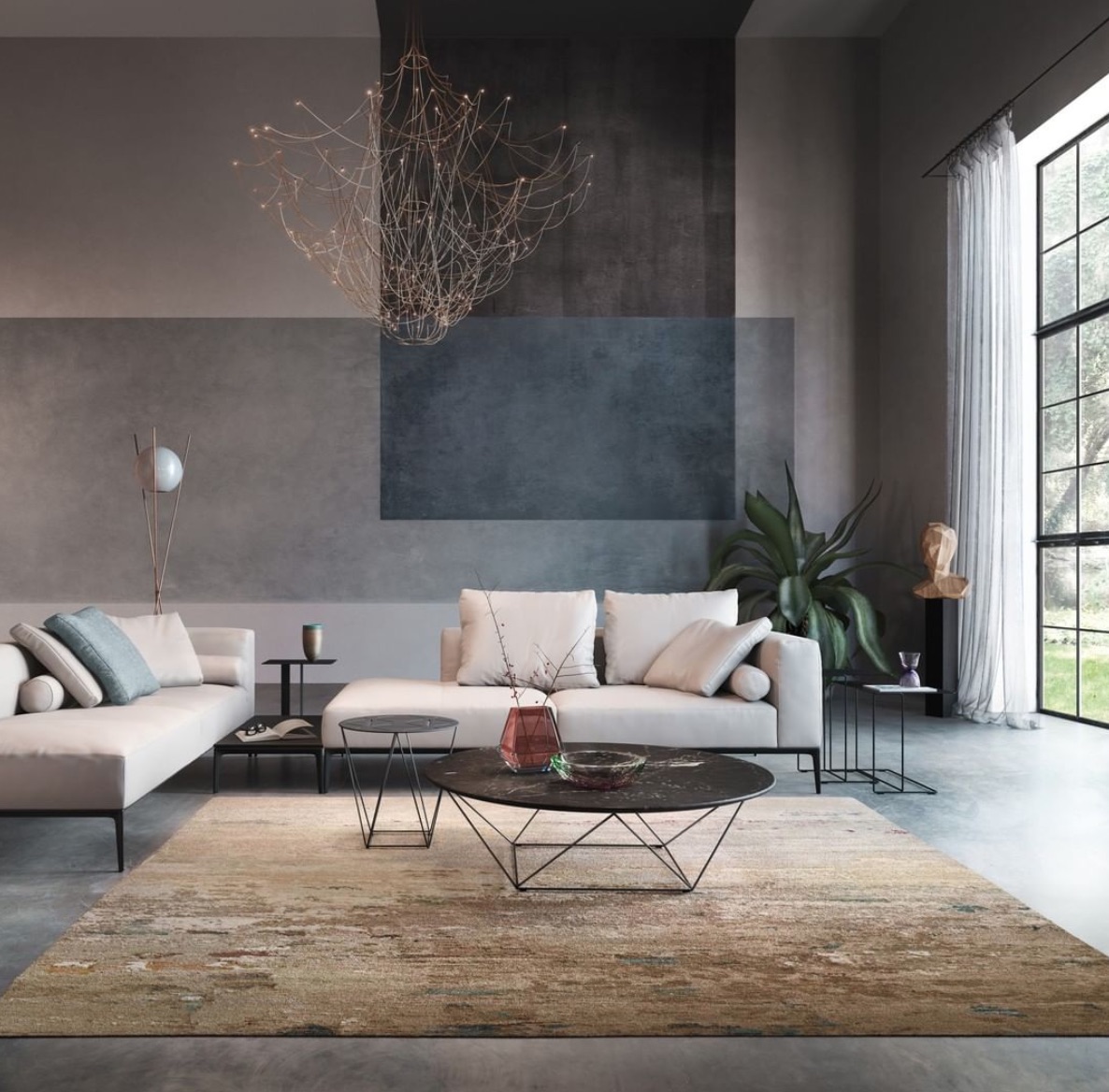
The room takes on an overall neutral base color. Large swaths of paint extend from the ceiling and horizontally, and when they collide a blend emerges. Source Link
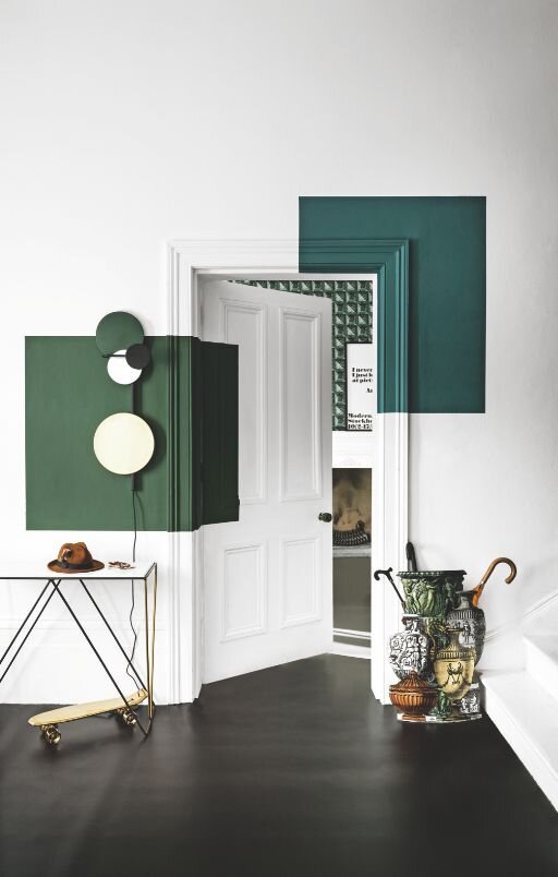
A room can’t go wrong with a pristine white canvas, but adding a bold color like these shades of green brings in a sense of edginess. Source Link
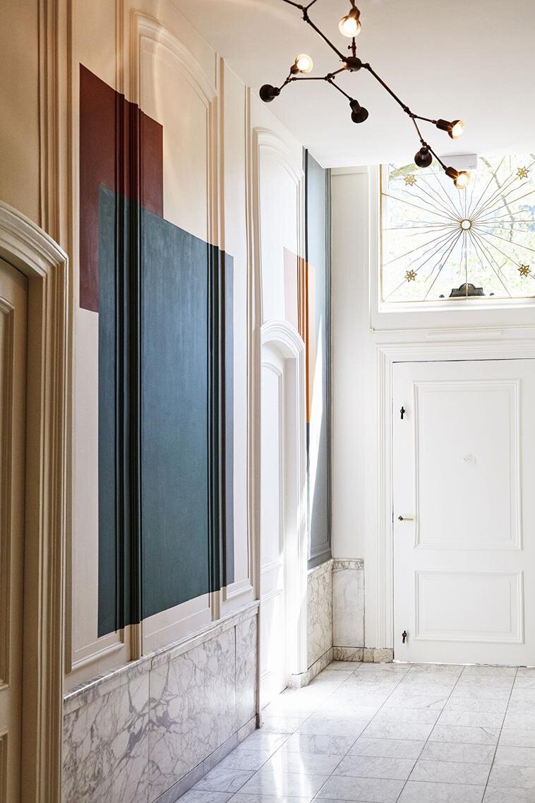
The Hoxton hotel in Amsterdam merges 17th century design with retro fixtures and color palettes. The rooms are detailed to perfection, but the hallways are not to be missed. Source Link
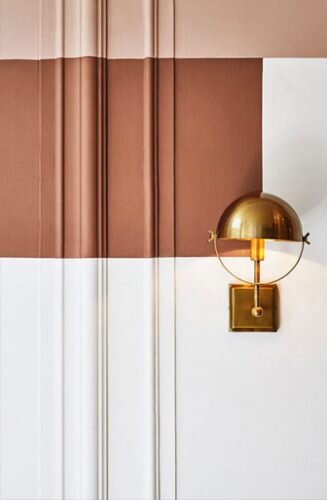
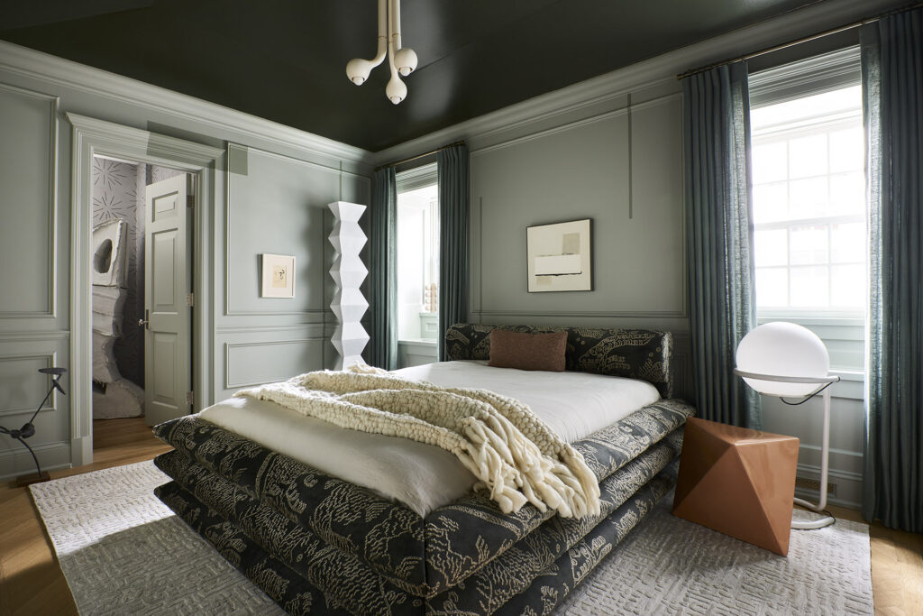
This brass sconce layers beautifully with stripes of warm, earthy red and blush tones. Source Link
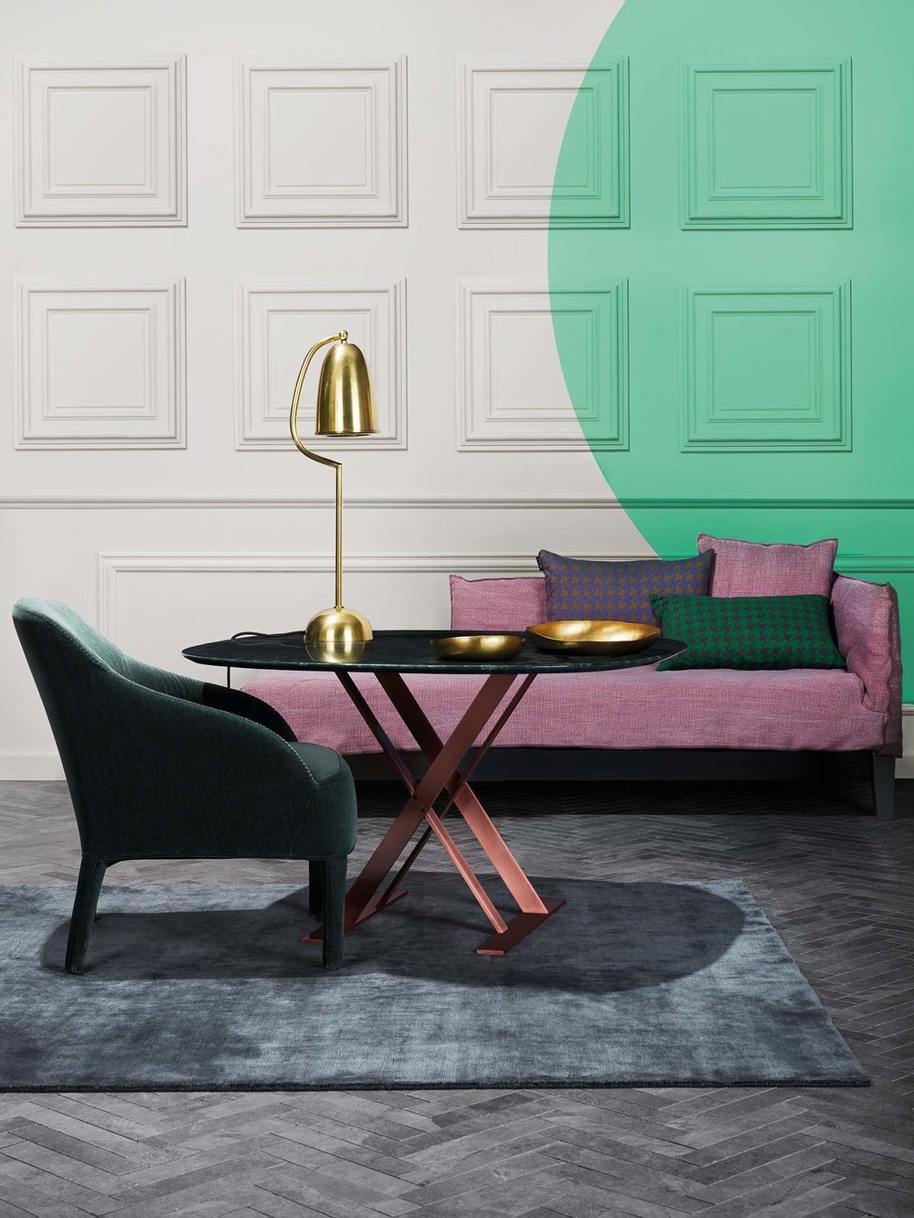
Color doesn’t always need to be applied in blocks. Photographer Omar Sartor’s portfolio includes a minty eclipse. Source Link